Data Viz Recap - The Good, the Bad and the Biased: Five ways Visaulisations can mislead (and how to fix them) by Danielle Szafir
Today I read a paper by Danielle Albers Szafir from University of Colorado Boulde, where she explores thew ways in which visualisation can mislead audiences.
I wanted to give a breif summary of what I’ve found!
When, why, how?
Visualisation shows a unidersaility visual stratucvutiorn when statistics fall short! Szafir list a criteria for assessing data visualisation which is a trade-off of flexibility vs presision. These include;
- Uncertainty (does staticis represent data?)
- transparency (What does the underlying data look like?)
- context (does visulisation aid in out decision making process?)
- scale (how many diustinc quantities do we need to evaluate?)
- exposition (what story does our data need to tell?)
- purpose (do we know what we are looking for?)
Steps in Visualising Data. Which step dooes misleading visualisation occur?
Steps to visualisating raw data include;
- Clean Data
- Precompute relevant information, map that information to different visual channels (e.g., position, size, color)
- Integrate interaction and other details where appropriate.
Step 2 is when problems with visualisation occurs!
Lessons
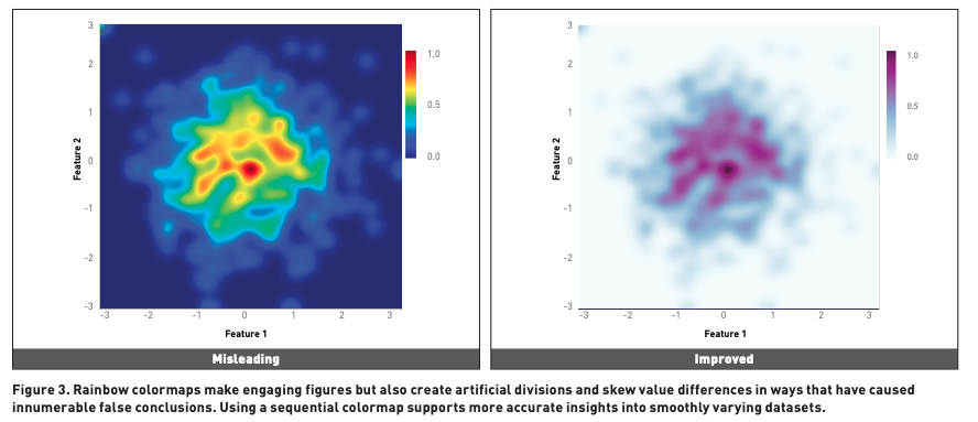
Lesson 1 : Don’t used rainbow colourmaps for continous vairables
Visualising using the rainbow coulour hue can be lead to misleading
- Visual intepretation: People see pattern in colour, thus using raindbow shgow colour changes misleading people about data interpretation
-
Bias colour blind people : 1 in 12 people care colour blind, thus interpret rainbow colours didferently!
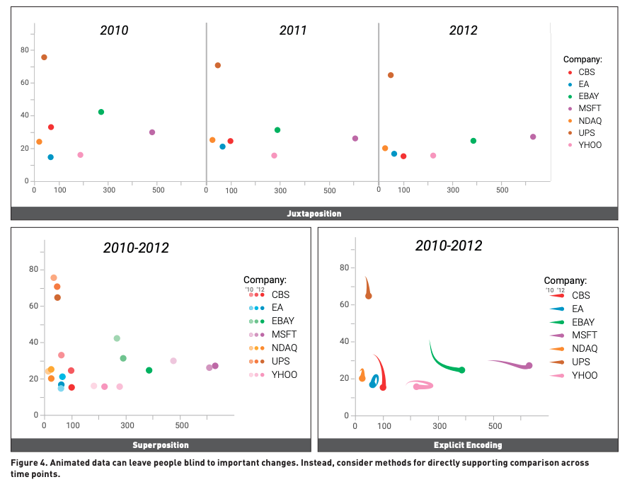
Lesson 2: Don’t use animation as people can see subtle changes year to year!
Human suffer from ‘change blindness’ - people lose sight of most data points over multiple graphs! Thus without guidence is can be hard for people to intepret change. To prevent these there are 3 main types with different prupose to show change;
- Jaxposition - used in large datapoint but hard to specifically show difference
- Superposition - show immediate changes, but limited to only couple data points
- Explicty encoding - Show indvidual difference, but analyss need to intepret which is most important!
Lesson 3 : Scale are important!
The main problem is impropoer normalisation and comparing different graphs using different scales.
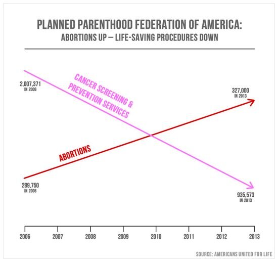
In this case both scales are different y-axis, misleading viewers that abortions has increased to more then cancer screening.
Improving these scale
- Always start from 0 axis
- If wanting to show change, then computer changes relative to some baseline
Lesson 4: 3D visualisation sufffer’s
3d animations suffer from 3 main flaws;
- occlution - object make other object hard to view
- projection - our netual visual cues distort 3d images, by where object that a further away looks smaller
- perceptual ambiguity
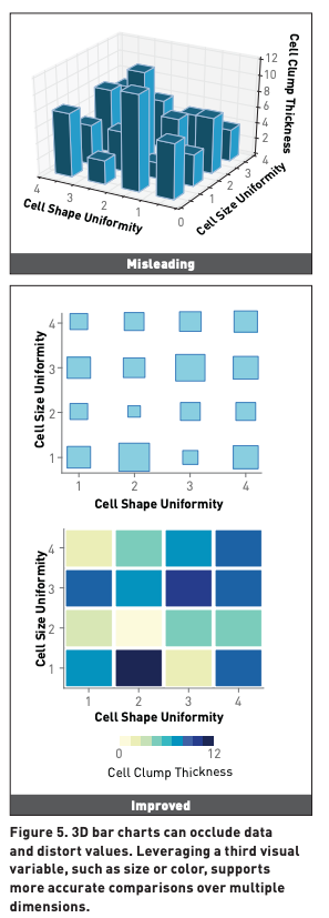
In this case occlusion offuce in the 3D image since we can see the middle bars. Porjection occur where the right corner bar look small then the front bar even they there are the same size, causing perceptual ambiguity.
Lesson 5: Show don’t tell
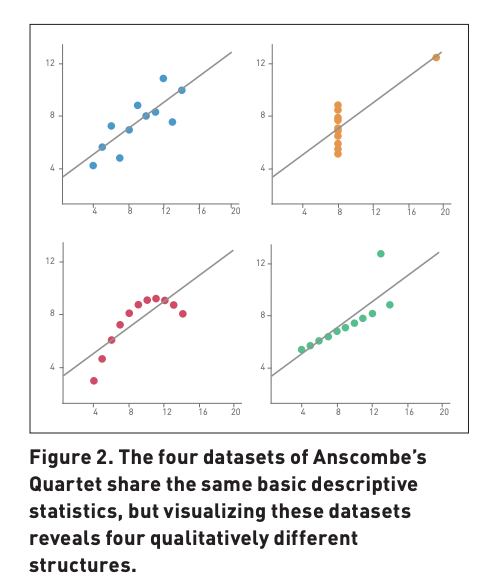
When makling decision with algorithms is imrpotant, but making these decision without understanding the strcutuvre of data can lead to misinformed decision making!
When consdiering viosualisation and staticis found when exmaing the visuyalisation allows used to under the strucutre of data!
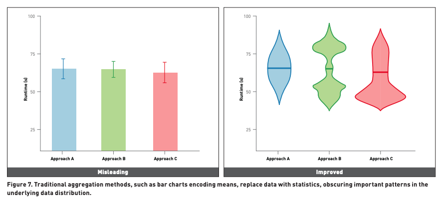
For example when we consdier the mean of 3 different approaches they look the same (left), but the udnerlying distribution of data points (right) present the better options would be approach A! This is known as the ‘within the bar bais’, a bias we add through bar charts!
Conclusion
My main takeways is there is allot oif misinformation when looking at in charts, and as analyst we must conduct exploratory data analysis to ensure we make the right decisions!
